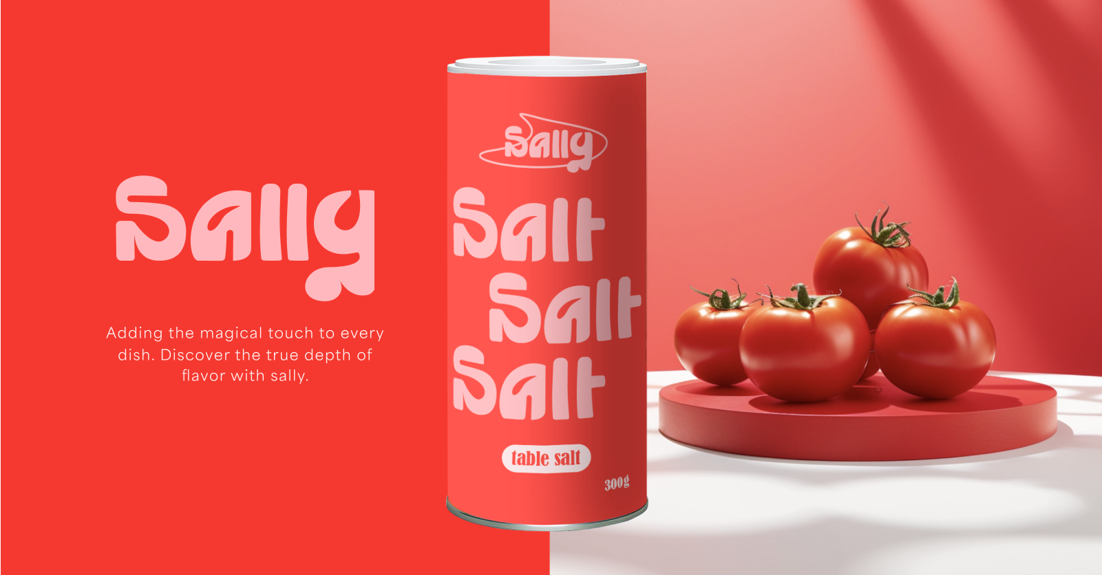

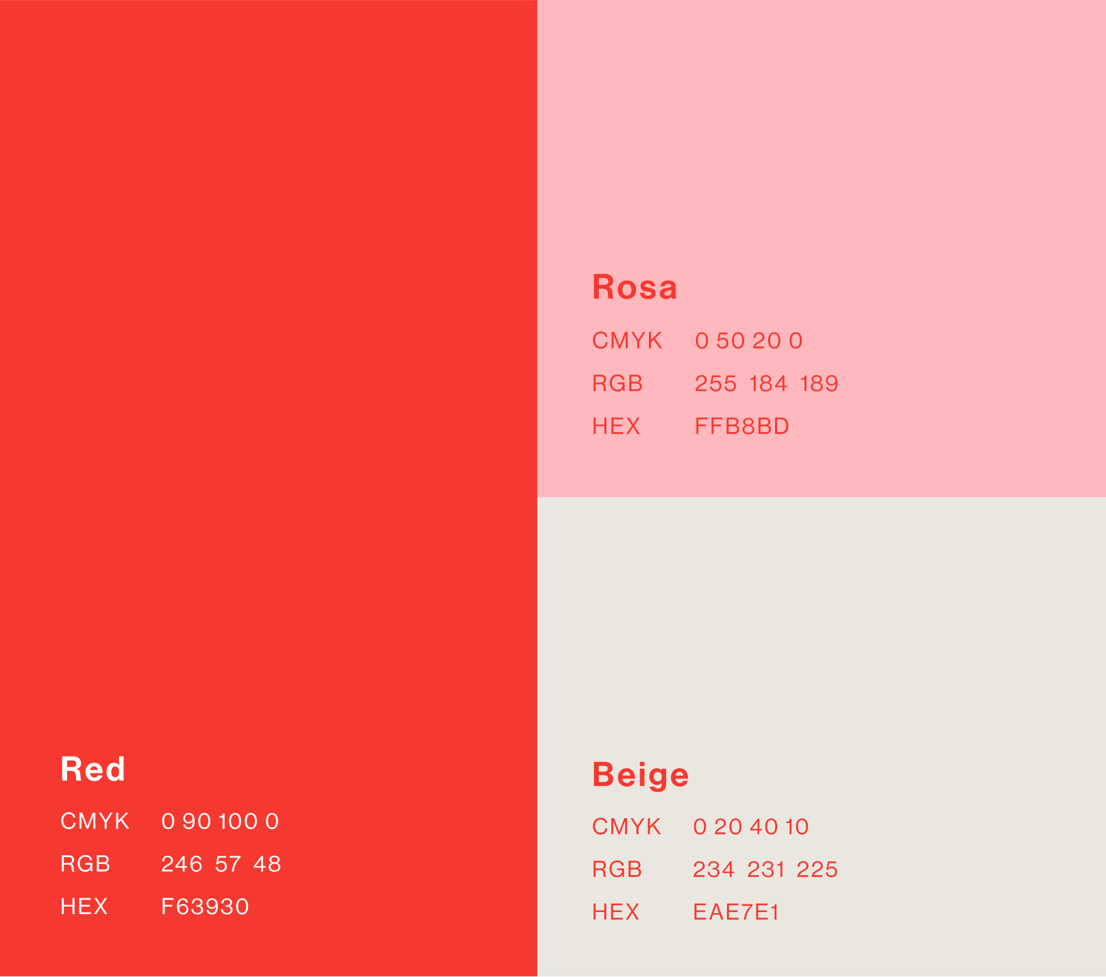
Colors
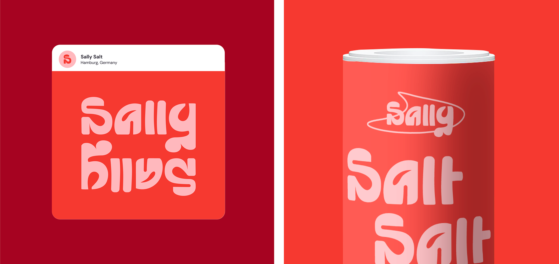
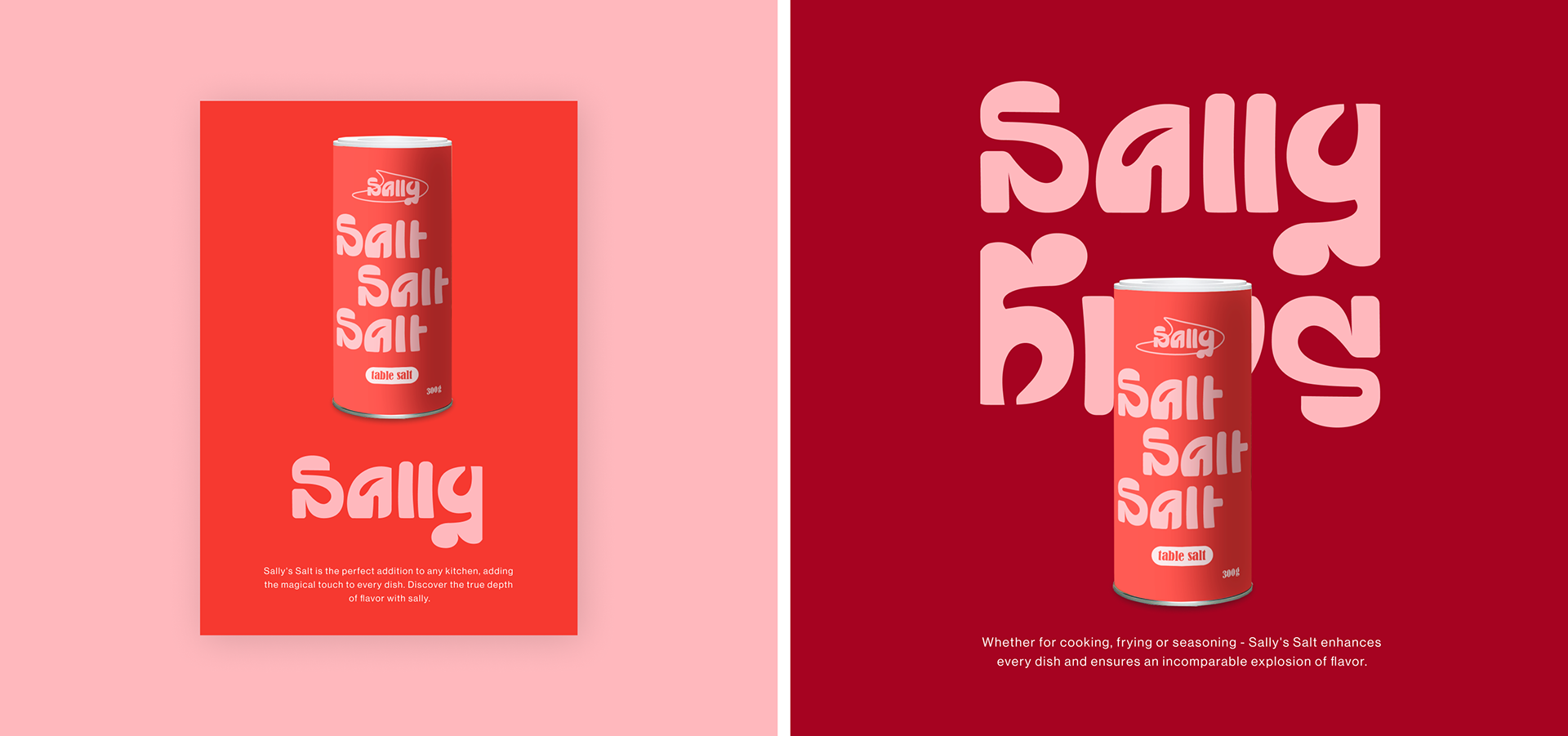
The red is the basic color and is used across the entire packaging. The eye-catching typography on the packaging is presented in pink, while the beige creates a harmonious balance and is only used to a very limited extent.
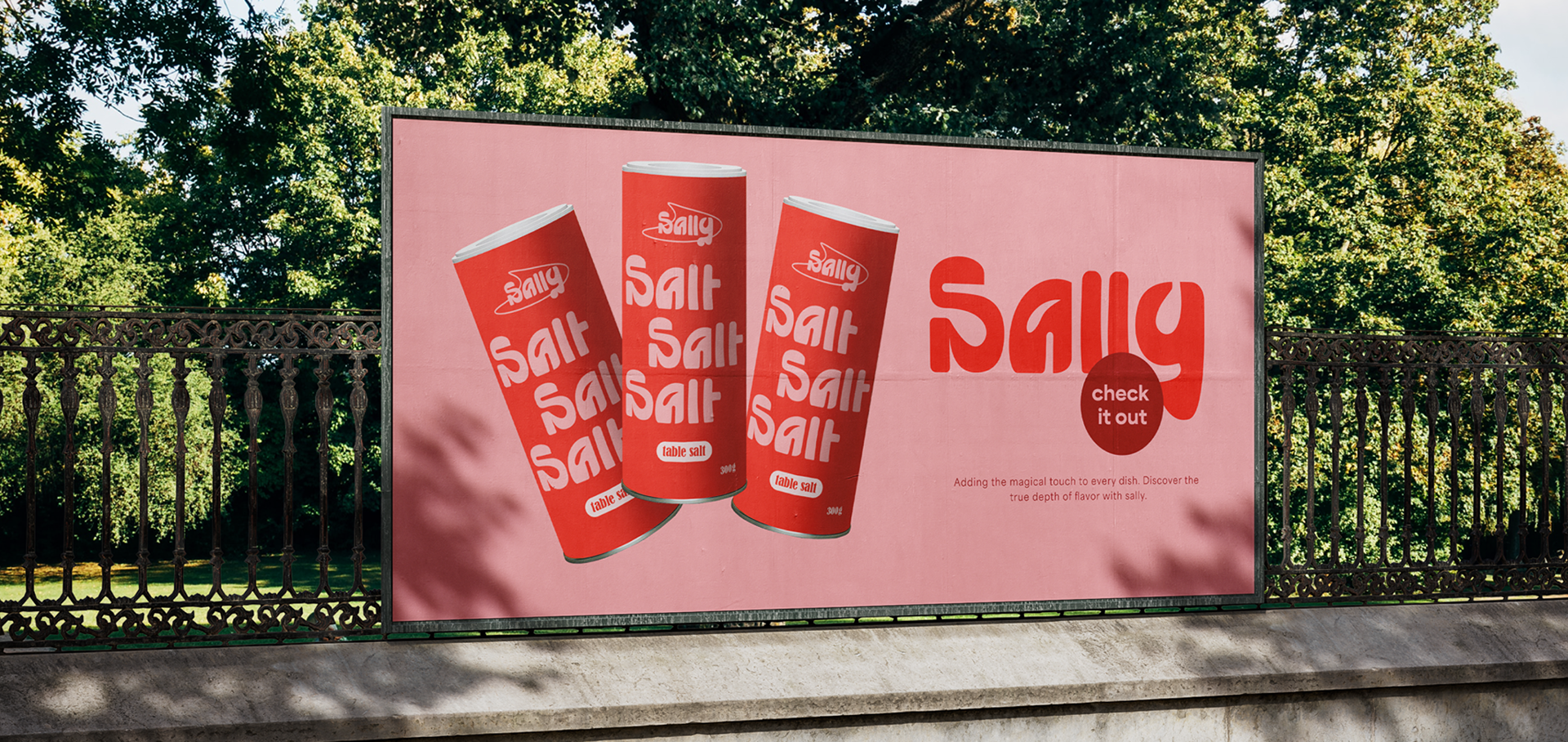


Why does salt packaging often have to be practical? Why not a design that is as appealing as it is functional? A simple packaging that not only stands out in the kitchen, but also makes a small statement. Practical, simple and a little bit special.